Forms: made by humans, for humans
The Digital Team has extended its user-focused approach to City forms and applications.
We’ve mentioned before that we’re not just a “digital” team. The work of our design and content staff often extends into the printed world, and that’s true of our recent work on City forms and applications.
As much as we’re pushing to move everything online, we know we need to provide options for folks who don’t have easy access to the Internet. However, that doesn’t mean we can’t create the same intuitive experience we’ve been working toward through our digital tools. With the help of our brand and user testing, we’ve been making some big changes to City forms.
Why we did this
We are well aware of the reputation government forms have for their lack of clarity. Who hasn’t looked at an application and grumbled over the confusing wording, or sighed at a cluttered design and thought, “Who made this?”
A poorly designed form is an unusable one. When constituents understandably become frustrated and confused, City staff end up answering more emails and phone calls. This costs us time, money, and — just as important — it takes staff away from focusing on other work that needs doing, and people who need extra help even under ordinary circumstances.
Working with City departments, we’ve attempted to create forms that are more simple and direct, prioritizing information in a way that makes sense for both residents and staff. When our creative team started its work on forms, they focused on three key ideas: legibility, readability, and hierarchy.
Easy to read
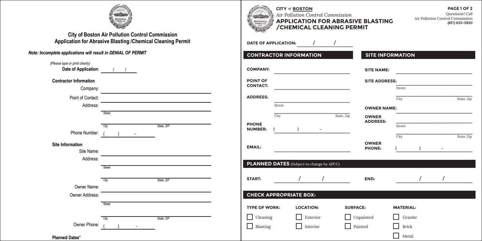
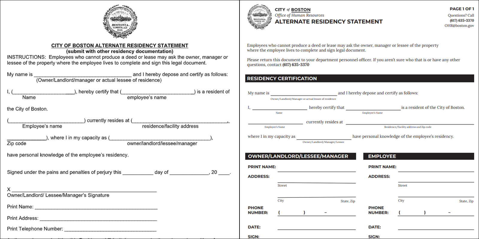
Many traditional form layouts try to cram way too much information into not a lot of space. Technically speaking, you’re wasting less paper by doing this. But, a designer is forced to use smaller fonts and less white space, making the form more illegible and harder to understand.
Forms like this are not just annoying to read — they can lead to more mistakes. Smaller font sizes also make us look like we’re trying to hide something. By boosting the font size and adding white space to let the text breath, we’re giving our readers a break and allowing them to just focus on the information.
Easy to follow
We want our forms to look beautiful (yes, it’s possible!), and for folks to find them aesthetically pleasing. However, a well-designed form isn’t useful if we haven’t set up a clear hierarchy of information. Instead of providing a big information dump, we need to make sure users see the most important information first, and then go from there.
By following our brand and being deliberate with our use of big, bold headers, we can draw a person’s eye to the sections that are most important. Our goal is to find that sweet spot where aesthetics and utility overlap to create a delightful user experience.
Easy to understand
The first — and probably most important — thing to consider when building a form is the actual text. The goal with our digital tools is to aim for a seventh- to eighth-grade reading level with our writing. Why? The average American reads at a seventh- or eighth-grade reading level, and we want to be as accessible to as wide of an audience as possible. Why should things be any different with our printed forms?
Our general rule of thumb is to know your audience, and to be as simple and direct as possible. We use the active voice as much as we can, and we’re not afraid of saying “you” and “we.” You shouldn’t need a doctorate degree to understand how to fill out an application for a permit.
Importance of public input
Our form changes were based around best practices and our assumptions, but that’s never enough. Input and comments from the public are a vital part of the design process. We knew we had to test our new layout out with residents of the City.
So, we took copies of a couple of our old and new forms to the Registry Department in City Hall where there’s usually a line of folks waiting to pick up birth, marriage, and death certificates, and we asked them for their thoughts. When compared to our old forms, our testers found the new layout much easier to use. By removing a lot of clutter and focusing on the details, we created straightforward applications that were easy to fill out. As one tester put it, “This form does in two sentences what the other one had taken a whole page to do.”
At the moment, we’ve only been able to work on a handful of forms, but we’re spreading the gospel about our designs. By leveraging our brand, we plan to continue to create printed material that is easy to use and understand.
Want to help? If you have a moment, please compare the old and new forms on this page and give us your thoughts at feedback@boston.gov. We’re constantly iterating and improving the way we do things, and getting your input will help us achieve that goal.


