Why it’s critical that your website is keyboard accessible
Our goal is to build digital experiences that work for all residents. That means we are constantly looking to make digital tools better and more accessible for our users. We wanted to highlight some of our recent work.
Focusing on accessibility has always been a top priority for the Digital Team. To that end, we’ve been working over the past several months with Iterators LLC to conduct an accessibility audit of Boston.gov. They helped us test our website to make sure folks can more easily navigate the site and access all of its services and resources, including those with:
- low vision, no vision, or color blindness
- hearing impairment or loss
- motor or developmental disabilities, and
- light-induced epilepsy.
We found a few potential areas for improvement. These ranged from sensory characteristics, like color contrast, to navigation characteristics, like how users interact with links and buttons. We decided to tackle these improvements by category, starting with keyboard accessibility.
Why keyboard accessibility is important
The Web Content Accessibility Guidelines (WCAG) 2.1 state that a website or digital product is keyboard-accessible if:
“all functionality of the content is operable through a keyboard interface without requiring specific timings for individual keystrokes, except where the underlying function requires input that depends on the path of the user's movement and not just the endpoints.”
What does this mean? Users should be able to exclusively use a keyboard — rather than a mouse — to navigate the website. Many folks with motor disabilities or vision impairments rely on their keyboards to navigate websites. A website not built and tested to meet keyboard accessibility standards can prevent them from having an enjoyable and successful user experience.
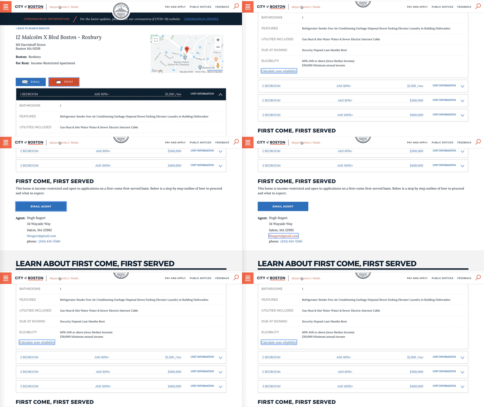
“Focus indicators”, for example, show users what element on a webpage is being engaged with in a given interaction. What is a focus indicator? One example is the colored outline that appears around buttons, links, and other interactive elements when you hover over them with your mouse. For those who rely on the “tab” key to navigate through the interactive elements of a webpage, focus indicators are critical to a good experience. These users can’t rely on the mouse if a focus indicator highlight fails.
As a keyboard user tabs through content on the webpage, interactive elements should highlight. In many cases, web browsers provide these focus indicators automatically. But, it is possible for styling elements of a webpage to hide these focus elements. The focus also may be so subtle that it is difficult to see, especially if someone is tabbing quickly.
The order in which interactive elements on a page are highlighted by tabbing can also negatively impact an experience. If the order is clear, reliable, and intuitive, the user can more easily navigate through content. But, if the order does not follow a predictable pattern, this can make for a clunky and frustrating user experience. This is why the order of the focus is so important.
There may also be elements on a page that are completely inaccessible via a keyboard and need to be reconfigured. If this is not done, there may be whole sections of a website that are totally unreachable for keyboard users. In the case of Boston.gov, this is all the more important. We have resources and tools across the site that residents need to access to complete transactions and get up-to-date information.
Improving keyboard accessibility
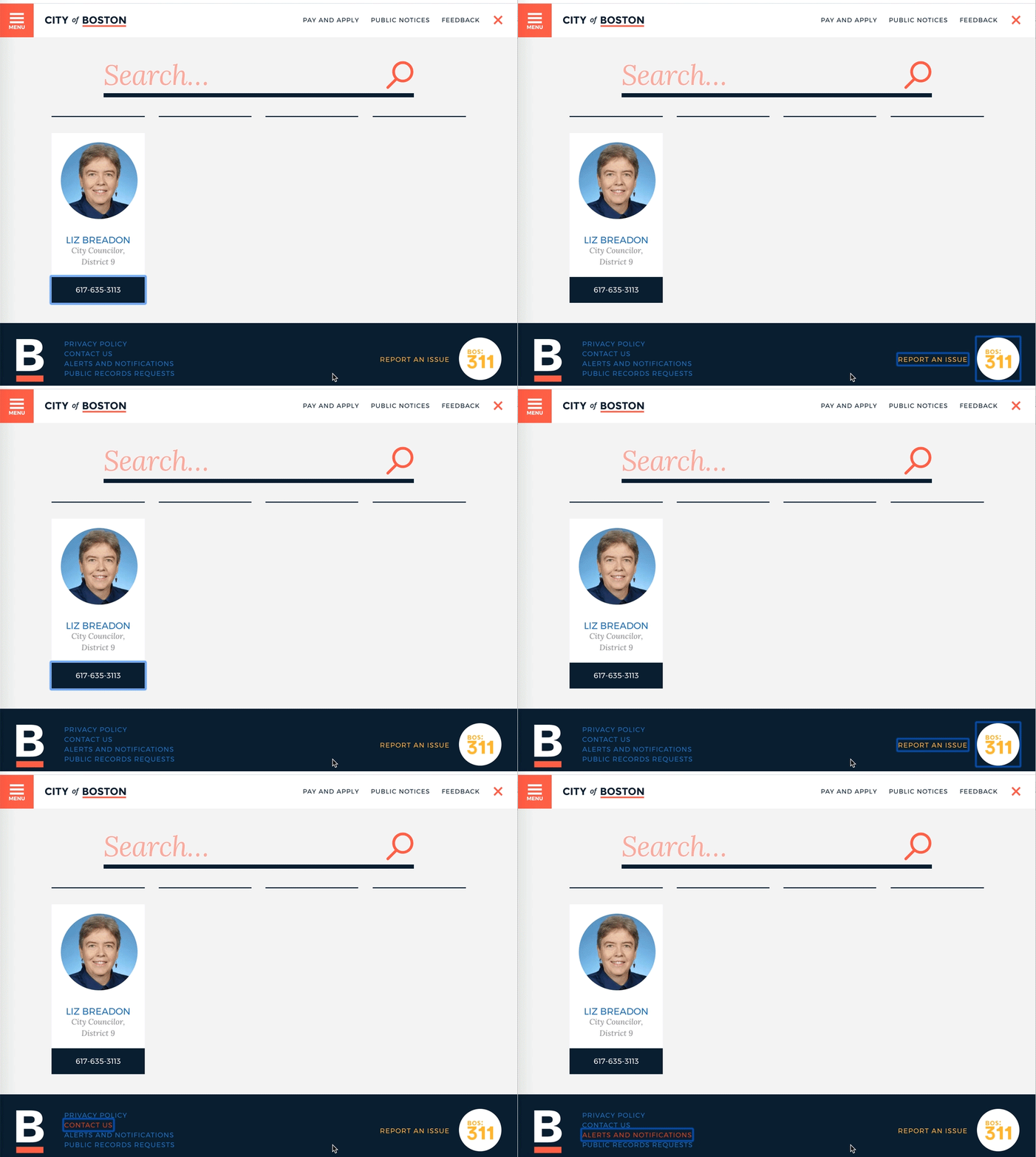
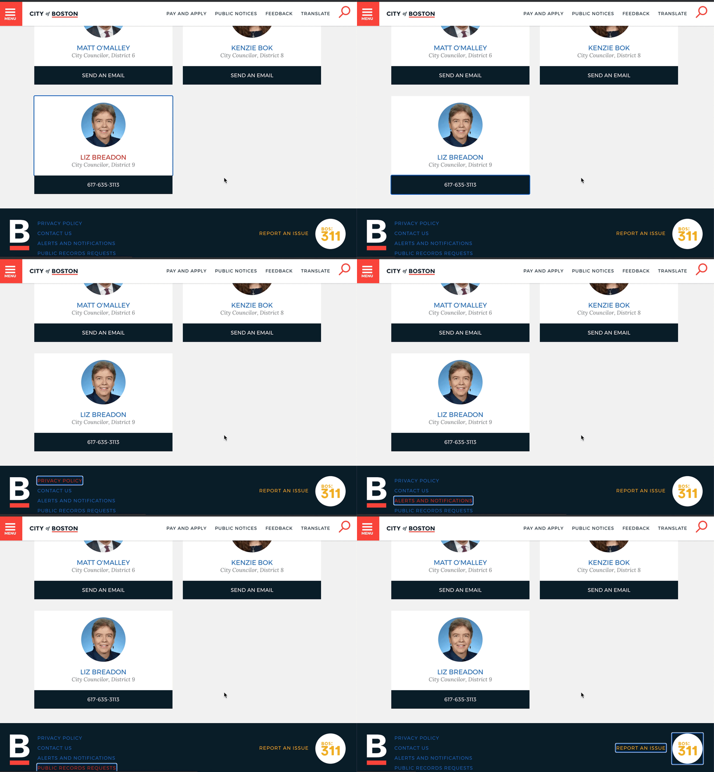
Working with Iterators, we identified several of these keyboard accessibility issues on Boston.gov. For example, in the video above, you can see a keyboard user moving through the interactive elements on the Boston.gov homepage footer. The order of the focus indicator does not follow a predictable pattern. This makes navigating the page confusing. A left-to-right sequence would be most intuitive. But, in the video, you can see that the first element highlighted by the keyboard focus is the BOS:311 icon on the far right-hand side of the footer, rather than the list of links on the far left-hand side of the footer. By ensuring that the keyboard focus highlights elements in an order that is intuitive, the user can more easily navigate the page. In the video below, you can see how the changes to focus order improve the user experience.
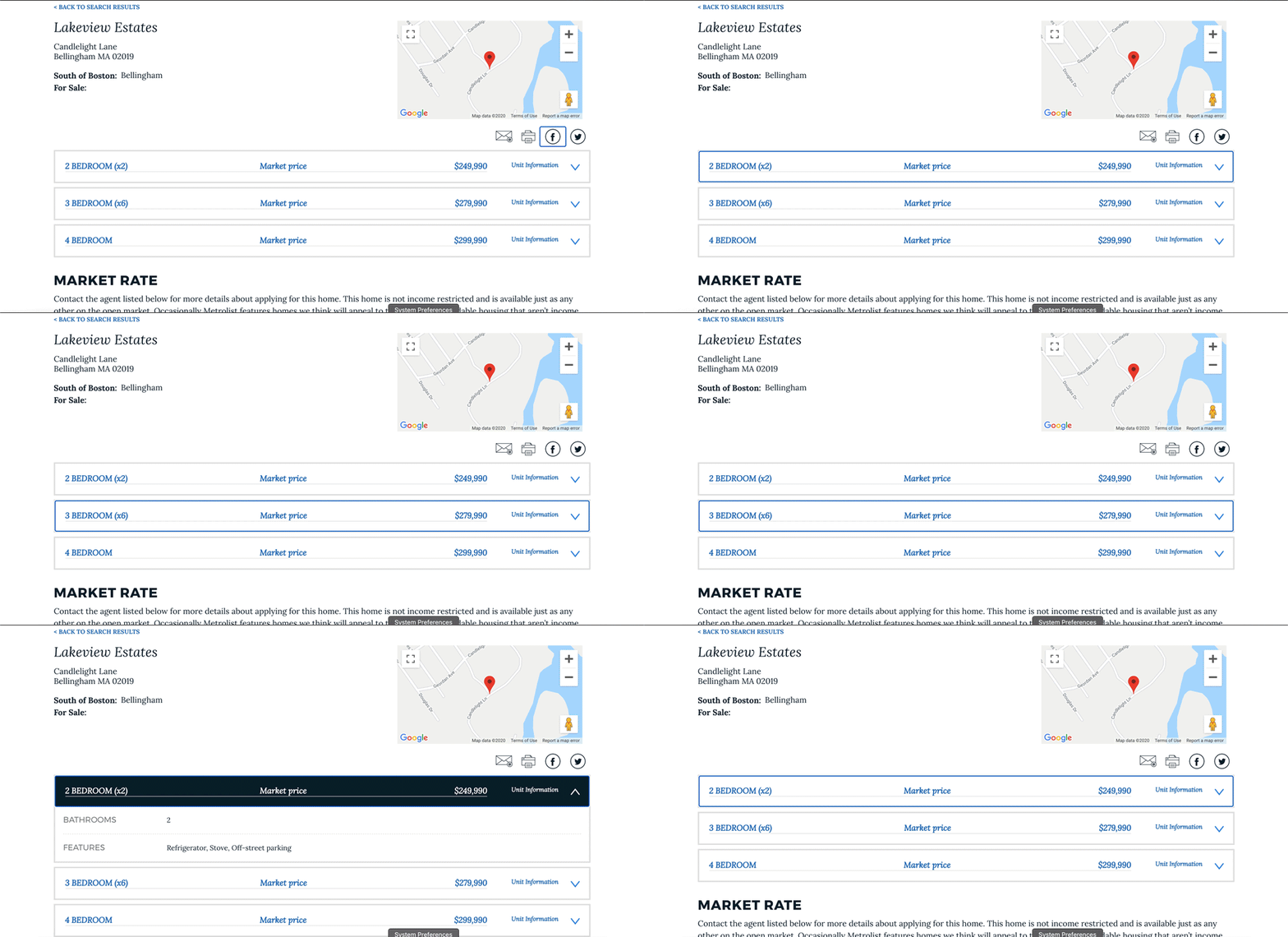
Below is another example of a webpage component that was previously inaccessible via keyboard. In the following videos you can see a keyboard user trying to navigate through a set of components called “drawers.” In the first video, the keyboard focus skips over the drawers completely as a user tabs. This means that they can’t engage with them at all. Drawers like these appear on many other pages across Boston.gov. In the second video, you can see the keyboard user successfully opening the drawers and accessing the information that they contain.
Where we go from here
Since we are addressing each category of issues one at a time, there are many more improvements to come. Stay tuned for more accessibility updates on Boston.gov, including larger font sizes and page color contrast for those with low or no vision and color blindness.
While we’re proud of the latest progress on Boston.gov, we know there is always room for improvement. We’re looking forward to a more accessible future for Boston.gov, and we’d love to hear from you. If you have any feedback or concerns, send us an email at digital@boston.gov. We’re also in constant partnership and communication with our colleagues at the Disabilities Commission. If you write to them about your experiences on Boston.gov, or with any of our digital tools, they will also make sure to share your feedback with us.
This post was written by Claire Ogden, a fellow working with the Digital Team at the City of Boston this summer. She's a rising senior at Brandeis University studying Media and Communication. You can connect with her on LinkedIn.


