There’s more than meets the eye to web accessibility
You may have noticed some minor but important adjustments to Boston.gov in recent weeks.
The Digital Team always advocates the importance of accessibility in design. Our goal is to meet AA compliance, based on the Web Content Accessibility Guidelines from the organization that sets web standards.
While we strive to meet that mark — and thought we were — an email that the City’s Disabilities Commission received from a constituent alerted us to the fact that we were falling short when it came to our use of colors. Thanks to some minor tweaks to our pattern library, we were able to create a more accessible experience for our users.
Reacting to user feedback
We’ve always relied on input from the people who use our digital tools, and this case was no different. A subscriber to the Disabilities Commission newsletter reported having trouble reading links through our newsletter system. When a Disabilities staff member dug deeper, they found that the problem was stemming from our colors and styling. They were not meeting the color contrast ratio set for accessible text.
Fortunately, we have our digital branding in a pattern library that guides the styling and colors across our digital tools and Boston.gov. With our design specifications housed in this central location, we knew we could review the necessary changes and consequences more easily. We decided to take a step back and revisit all of the colors used in our brand guidelines to make sure we were meeting our digital accessibility goals.
Getting help from some friends
The Digital Team has been fortunate to have a great partner in IDEO. Aside from designing Boston.gov, they’ve also been there for us when we need someone to bounce ideas off of. We put together an impromptu brainstorming session with them to figure out the best way to move forward. We were excited to include industry experts as we worked to resolve this issue.
Diving into the details
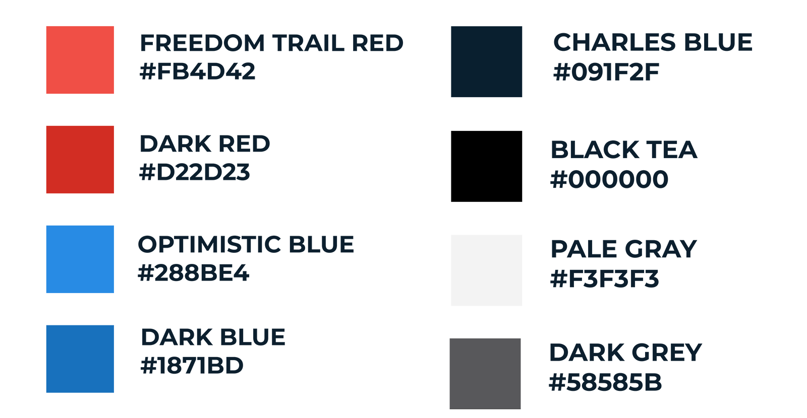
On certain background colors, we just weren’t meeting the minimum standard for color contrast ratios. We found issues with two main colors on the site:
- Freedom Trail Red (#FB4D42), and
- Optimistic Blue (#288BE4).
They were problematic in certain uses of our secondary colors for text. For example, if we used an Optimistic Blue color on Pale Gray or our Charles River Blue background, it wouldn’t actually provide the level of contrast required.
Thanks to some initial research by one of our software engineers, we were able to create a baseline that nearly matched our original colors while meeting AA compliance. The basic idea we came up with was to create light and dark options for everything. Depending on the background-color, we’d switch between the light and dark versions to make text more readable.
Our IDEO colleagues helped us put together a color palette on the fly. They broke down all of our options for text color based on our background colors. If you check out our color palette, you’ll see what’s acceptable.
We tinkered with our initial new colors until we came up with the options you see above. With our new hex codes, we updated our pattern library to make the changes on Boston.gov. We’re now in the process of updating the rest of our digital tools, including our newsletter system, to make sure they’re also as accessible as possible.
Where we go from here
One change you should be seeing soon on Boston.gov is an underline for all of our inline text links. Contrast is important, but underlines add another helpful distinguishing factor for those who struggle with colors. We want to make it clear what you can and can’t click on the site. As always, we’ll continue to pay attention to W3C updates and recommendations for web accessibility. If you’re interested in web accessibility, Google has some great guides on best practices.
We know we’re not perfect. There’s always going to be something we can make better. That’s true whether it’s design, content, or technology. The important thing is that we keep our eyes and ears open to potential opportunities for improvement and change. Boston.gov and all of our digital tools are an ongoing effort. That’s why your feedback is so critical to our process. If you see something you think is wrong, or have an idea for ways we can make our tools better, please email us at feedback@boston.gov.


