
Climate Ready Boston Map Explorer
This tool allows you to explore the spatial data used in Climate Ready Boston. You can also learn more about climate preparedness projects across the City.
The Map Explorer features spatial data from Climate Ready Boston. Explore which areas in Boston are projected to be at risk of flooding (due to sea level rise and increased precipitation) and extreme heat (due to rising temperatures and the urban heat island effect). Overlay climate data with population demographics to better understand the social factors that intersect with and contribute to vulnerability. See the current and upcoming projects the City is working on to enhance climate resilience. And then dive deeper and download the data through the City's Analyze Boston platform.
Note: This tool is intended for educational and outreach purposes. It should not be used for technical planning.
-
Still have questions? Contact:
Environment
-
 1 City Hall Square
Room 709Boston, MA 02201-2031
-
Ready to explore?
Map Examples

You can compare specific data sets by turning on and off layers in the "Layers" tab. This map shows 2070 coastal storm flooding conditions overlaid on top of areas with a higher concentration of older adults. Older adults (those over age 65) have physical vulnerabilities in a climate event; they suffer from higher rates of medical illness than the rest of the population and can have some functional limitations in an evacuation scenario, as well as when preparing for and recovering from a disaster.

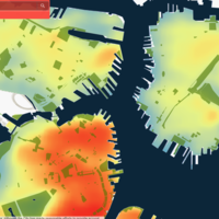
You can zoom into specific areas manually or use the search bar to find a specific location. This map is comparing land surface temperatures with open spaces. At this more detailed resolution we can notice that areas around parks tend to be cooler.
Map Components
Map Components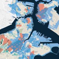
Layers
The visibility and opacity of layers displaying data related to flooding, extreme heat, and social vulnerability can be adjusted in the “Layers” tab to compare specific datasets and create a unique look.
Details
You can view information about each component and its source data by clicking the feature on the map. More details, source information and links to download the data are available in the “Details” tab.
Basemaps
In order to explore your neighborhood more in depth and get the look you desire, the “Basemap gallery” tab allows you to swap out the light grey underlying map for other street maps or satellite imagery.
Details: Area of potential coastal and riverine flooding in Boston under various sea level rise scenarios (9-inch in 2030s, 21-inch in 2050s, and 36-inch in 2070s) at high tide and in the event of storms with an annual exceedance probability (AEP) of 10 and 1 percent.
Source: Boston Harbor Flood Risk Model, MassDOT.
Details: Approximate stormwater flooding extents from a 10-year, 24-hour rainfall event under various climate conditions, due to combined future sea level rise and extreme precipitation (5.6-inch, 5.8-inch, and 6-inch rainfall).
Source: Boston Water Sewer Commission Wastwater Facilities Study
Note: This data should not be used for detailed analysis as it does not necessarily identify all areas subject to flooding particularly from local drainage sources of small size. Users should be aware that inundation areas are calculated by mathematical models with precision that is limited to historical calibrations.
Urban Heat Island Intensity Index:
An urban heat island is an area that is hotter than the areas that surround it. Cities like Boston tend to be hotter than suburban and rural areas. Within Boston, areas with more buildings and concrete roads and less trees and green spaces experience higher temperatures, also known as the heat island effect.
The urban heat island intensity (UHII) map shows the averaged difference between the rural ambient temperature and the modelled local air temperature. The UHII map highlights areas of the city that are the hottest for the longest periods of time.
Heat Event Duration:
The heat event duration map shows how long extreme temperatures last across Boston during extreme heat events. Extreme heat even conditions are defined as temperatures higher than 95 degrees F during the day and higher than 75 degrees F at night. The colors represent the number of hours that extreme heat conditions last.
Daytime Air Temperature:
This map shows the modeled daytime air temperature at 3pm. Daytime temperatures are higher in dense areas and large paved spaces and lower in well shaded spaces and areas with significant tree canopy.
Nighttime Air Temperature:
This map shows the modeled nighttime air temperature at 3am. Dense areas release heat slowly because heat is stored between buildings and large, dark paved areas. Less dense areas release heat quicker because they are exposed to cooler nighttime air and ocean breezes.
Source: A citywide urban canopy model was developed to produce modeled air temperature maps for the City of Boston Heat Resilience Study (the Study) in 2021. Sasaki Associates served as the lead consultant working with the City of Boston to develop the study. The technical methodology for the urban canopy model was produced by Klimaat Consulting & Innovation Inc.
More: Review the methodology for more detailed information about the urban canopy model.
Details: Census tracts where the concentration vulnerable populations falls in the top quartile (25 percent) of Boston tracts. Social vulnerability is defined as the disproportionate susceptibility of some social groups to the impacts of hazards, including death, injury, loss, or disruption of livelihood. Groups identified as being more vulnerable are older adults, children, people of color, people with limited English proficiency, people with low or no incomes, people with disabilities, and people with medical illnesses.
Source: 2008-2012 American Community Survey 5-year Estimates.
-
Still have questions? Contact:
Environment
-
1 City Hall Square
Room 709Boston, MA 02201-2031
-
Ready to explore?
